Coloro 25/26 Color Predictions

It’s time for another round of my favorite topic!!!! Color predictions are so much fun and I’m super stoked about the upcoming colors. If you’re new here, here’s the deal:
Each year Coloro, an intuitive, logical, and innovative color system that decodes color as the human eye sees it and WGSN team up to release their color predictions.
In a 45-minute webinar, Coloro x WGSN reviews its color trend predictions for the next 2 years. This most recent webinar was super fascinating because it discusses the implications of extreme weather and the implications it will have not only on our daily lives but on which colors we’ll see become more popular across all industries.
I’m too excited so let’s dive right in!!!
Future Dusk

Does this color look familiar? That’s because you saw it in my Coloro 24/25 Color Predictions. I mentioned there that this color made me nervous because typically darker colors indicate moodier times.
From My Previous Post:
“Future Dusk is a color driven by the MetaVerse, fancy, and grand imagination. However, like I mentioned, dark colors usually indicate something big and scary is about to happen. Fortunately, lots of big and scary things are already happening. Maybe it wasn’t always like this, maybe it’s the 24-hour news system, but the good news and the bad news, is that it seems like multiple crises are happening simultaneously. AKA: Poly-crisis. A term first coined by Faith Popcorn, poly-crisis is happening and there’s nothing we can do to stop it. Except, ignore it, of course.”
Updated Future Dusk Thoughts
Future Dusk represents the the eery realities we are experiencing (longer summers, extreme weather, wars, etc). This color is reminiscent of the dusk or dawn hours that we will become all too familiar with in the near future. Due to extreme weather, we’ll choose to live a more nocturnal lifestyle. This color inspires us to live in the shadows, both literally (to keep cool) and figuratively (digital personas). Even Harvard is discussing how extreme weather will impact the future of remote work. The good news: you will have to work from home. The bad news: you’ll have to work from home. Every summer I swear the sun is personally trying to murder me. I don’t know if I will survive a summer that gets any hotter than our recent ones.
Future Dusk is great for interiors. Despite all of this, Future Dusk has restorative qualities as it creates a darkness without total immersion. This color will be seen on glazes, tinted glass, velvet, cars, and tech. I love the mysteriousness it evokes.
Celestial Yellow

I’m obsessed with this unusual color. It reminds me of a by-product of the pistachio and matcha colors we saw in the last few years in beauty, food, tech, and home interiors and home products (I love my pistachio colored KitchenAid Immersion Blender). I think Celestial Yellow represents our need for healthy and organic lifestyles. It reminds me of a color that Bryan Johnson would love because it’s youthful, organic, and future-forward inspiring. Combined with other colors (even in this post), it brings a different quality to the color it’s paired with. Put it next to Future Dusk and suddenly the future looks pretty bright. I guess the sun will come out after all!
This unique yellow has a tactile feel about it and it’s perfect for sportswear, interiors, and even tech. Imagine an iPhone or headset this color, you’d definitely never lose it in your purse.
With its barely there quality, it almost has a spiritual essence about it with a glow that makes you feel hopeful about the future. Isn’t that nice? :)
Cherry Lacquer

MY FAVORITE! Omg when I saw this I was sooo happy. This color reminds me of an old OPI polish called Midnight in Moscow. Cherry Lacquer is seductive, dark, and intense. In an age of rage and uncertainty, it embodies resistance and rebellion. Cherry Lacquer taps into our deepest darkest desires and taboos. It invokes self-empowerment, radical escapism, and deep, dark pleasures.
This color is going to be key for beauty (maybe Midnight in Moscow will come back!!) We’ll see this very versatile color in a lot of places, including all beauty categories. In fact, we’re already seeing iterations of this color on runways for Spring/Summer 2024. Who What Wear is reporting deep Burgundy and Oxblood as one of the latest color trends for Spring/Summer. Sorry to florals, maybe next go round!
Cherry Lacquer is luxurious in both a hyper matte or hyper gloss formula. Use this color to elevate any space or look and it pairs well with metals.
Neon Flare

When I first saw this color I thought ew, barf. It reminded me of 2012-2014. But there was this uncanny quality to this color I couldn’t quite figure out.
Neon Flare serves as a warning for repair. Despite it’s bright, cheery color it it sits in a juxtaposition between desperation and hope. Neon Flare is surreal and strange (but I think all oranges kind of are). This color will represent safety and repair during a time when safety colors will be most important (see Future Dusk). However, it is a cool and unique tone for beauty. I’d love this in a lippie, polish, and blush.
Something positive about this color is that it’s come back around thanks to Gen-Z’s rave culture revival. Neon Flare is also fabulous for active wear or for creating a sci-fi, powerful and mystical quality to your look.
Retro Blue
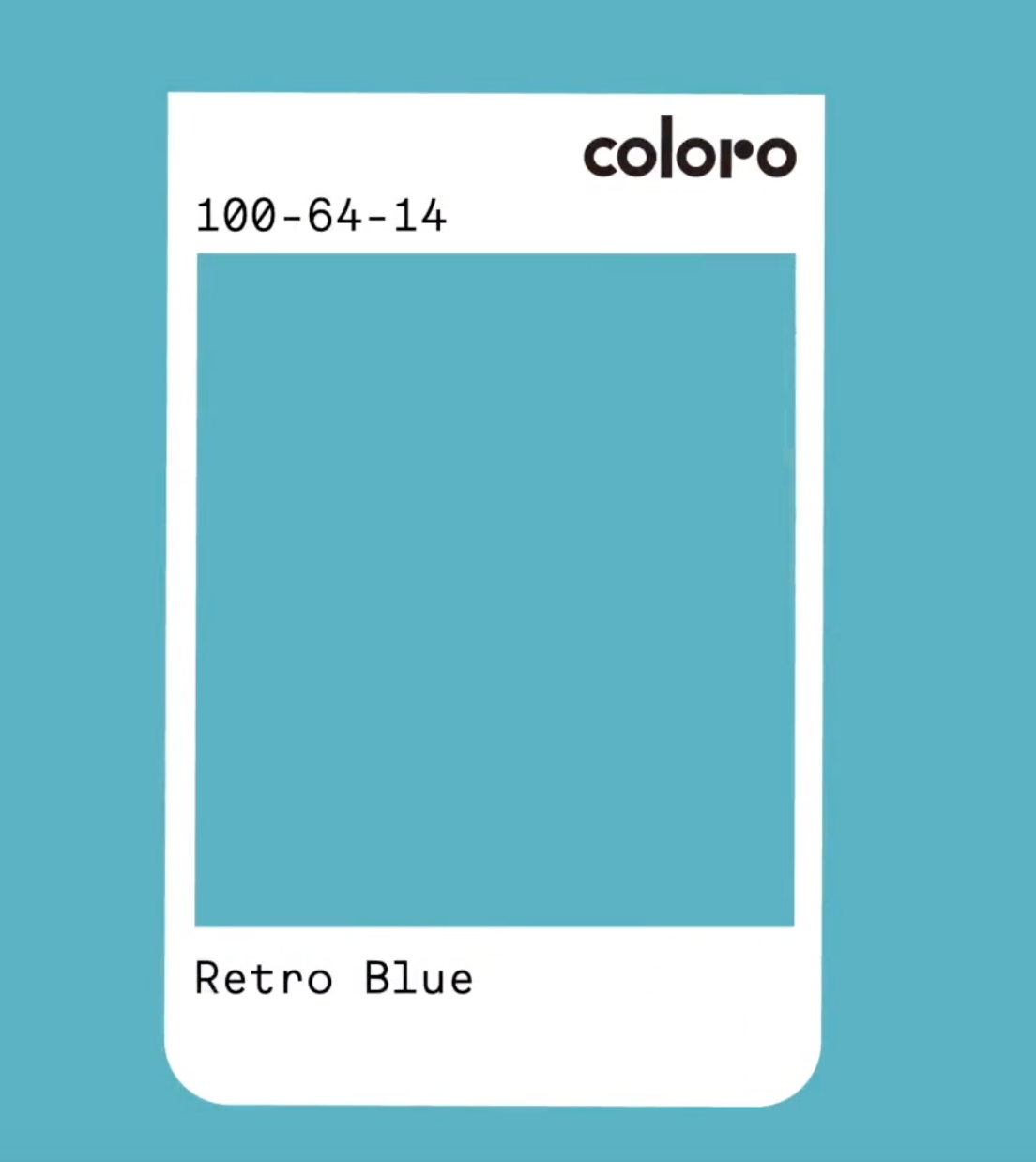
Retro Blue makes me want to rewatch Mad Men. A simpler time. When I wasn’t allowed to have a credit card. This off beat analog blue is soft and evokes joy and feelings of innocence. It’s almost like a Robins Egg Blue which always reminds me of Easter.
You may get this warm and nostalgic feeling for a time and place you don’t quite remember or maybe you’ve only ever seen it in pictures. Gen-Z lovessss nostalgia which makes sense as to why they love this color too.
It kind of reminds of the TradCath trend on Twitter but I choose to focus on images of vintage cars and KitchenAid Mixers. You can use this color to repurpose and revisit another time through interiors, fabrics, and auto and tech.
Retro Blue has this serious grounding quality that brings remedy to an increasingly virtual world. It has a tactile familiarity and a sense of time and place. It’s a classic! It pairs well with finishes like walnut and it’s both utilitarian and trans-seasonal. We’ll see this color relevant in 2026 and beyond. yay!
Color Your World
At Digital Candy, we are your eyes, ears, and feet on the ground to help you know what’s hot in digital and beyond! Let’s stay colorful together <3