Coloro 24/25 Color Predictions
Each year Coloro, an intuitive, logical, and innovative color system that decodes color as the human eye sees it, releases its color predictions. In a 45-minute webinar, Coloro reviews its color trend predictions for 2024-2025. If you have fond memories of 2012-2014, then you’re going to be super stoked for what Coloro is predicting over the next 2 years. But this time, it won’t just be about chunky necklaces and chevron patterns. This time, AI, VR, and AR are all a part of the mix, which makes these predictions even more exciting.
Let’s Wander Down Memory Lane
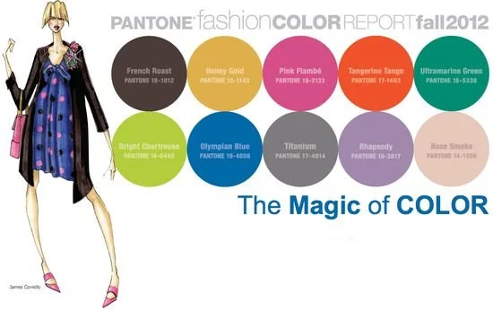
Ok, it’s 2012-2014. The world was about to end (ahhhh) and then it didn’t (booo). The peplum had a hold on everyone, we were tweeting, Instagram was still fun, chunky and fierce jewelry was how we expressed ourselves, and the divide between Indie/Tumblr Sleeze and Southern Prep was intense. Personally, I was an Indie/Arctic Monkeys/Tumblr/ Indie Sleeze girl. While the official Pantone Color Reports aren’t a 1v1 to Coloro, they’re pretty close.
Ok, anway, let’s not get stuck. I just wanted to do a quick recap of the colors from 2012-2014. We’re here to talk about the future, duh. Let’s get into it!
Future Dusk
Normally a color like this would send me running under a rock and hunkering down. Does anyone remember Pantone’s 2020 color of the year? Classic Blue? No? Well, here’s a little crash course on Color Theory and predictions, dark colors = hold on tight, something BIG and usually not great is about to happen.
But with the introduction of AR, VR, AI, and MetaVerse I’m actually super stoked!
Future Dusk is a color driven by the MetaVerse, fancy, and grand imagination. However, like I mentioned, dark colors usually indicate something big and scary is about to happen. Fortunately, lots of big and scary things are already happening. Maybe it wasn’t always like this, maybe it’s the 24-hour news system, but the good news and the bad news, is that it seems like multiple crises are happening simultaneously. AKA: Poly-crisis. A term first coined by Faith Popcorn, poly-crisis is happening and there’s nothing we can do to stop it. Except, ignore it, of course.
Future Dusk Plays into 4 MacroTrends:
Save Our Society
Save Our Society, all that doom and gloom is offset by people’s inherent desire to save the world. From 2012 to now, we’ve rediscovered a social conscience of ethics, passion, and compassion (yay!).
Vigilante Citizen
Vigilante Citizen, in some ways, has always been around. But it is most noted at the beginning of 2012. Pressure and politics put this consumer trend at the forefront. Remember Occupy Wall Street or #KONY? Today we have #StandWithUKraine and #BLM among many other great causes to fight for.
Cocooning
Obviously, we are super familiar with Cocooning. If you remember 2020-2023 then you remember the need to protect oneself from the harsh, unpredictable realities of the outside world. Remember the fact that not only could we not leave our homes because a deadly airborne virus was running rampant but we also were LEGALLY not allowed to leave? Fun times for introverts everywhere.
AtmosFear
AtmosFear is pretty self-explanatory; polluted air, contaminated water, and tainted food stir up a storm of consumer doubt and uncertainty. Today, 6/30/2023 as I write this the air in Cincy is being blanketed with plastic fumes and the WHO announced that aspartame is carcinogenic (duh. has no one tasted it?)
Future Dusk is a color that brings a sense of reassurance that will be key for 2025. Captivating tints of darks will gain momentum and be ideal for worlds within our world. To me, Future Dusk is indicative of new worlds that will evolve in 2024-2025. It might seem scary, unknown. and uncertain at first but I believe ultimately, we’ll see positive evolution in many, unique ways in both the real world and the digital world.
Transcendent Pink
When I saw this color I wanted to scream! I feel super spoiled in that we’ve been enjoying pink in its many gorgeous shades and hues for the last few years and it appears that we’ll get to keep enjoying the color and all its shades for a few more years to come.
Transcendent Pink is relevant for practical, longevity, and wide use. The gender-blending shade takes on a characteristic of an elevated neutral. Grounding and balancing appeal sets it apart from other shades in its color family and other colors in the neutral category. This shade of pink provides a reassuring presence that we don’t quite get from a true neutral like white, tan, or something similar. In fact, white has this cold, clinical feel about it. Talk about hospital vibes. Playing into the 4 macro trends I mentioned earlier, stability and cocooning qualities are present in this hue. It feels safe, familiar, and yet still fun, light, and airy. It’s not as burdensome as white (stains easy) nor as depressing as gray (self-explanatory). In Virtual World and tech, Transcendent Pink adds a touch of elegance and sophistication. You just feel classy and elegant just looking at it and considering it in your life; love that! Because the color is nearly genderless (like all colors honestly), it appeals to various genders, seasons, and products. Additionally, this pink harmonizes with many aesthetics; making it useful across aesthetics, genres, and corners of the Internet. Because it is still unique, after all, it is pink, it can bring a sense of novelty and innovation. I mean, does anyone remember pink Gameboys? That was the best! Imagine a dusty pink iPhone… drool!
Aquatic Awe
I’m not gonna lie, when I saw this color I got war flashbacks. If you went to an SEC school in 2012-2016 then you know the rampantness of the color mint. Honestly, the color spread just like the plant; left un-contained and now you had mint everywhere. FORTUNATELY, this iteration of mint mixed with pistachio offers something so much more than just bad memories.
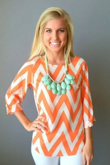
Aquatic Awe invokes the power of everyday wonder. The color whispers secrets of the good life and guess what it’s saying? The secret is actually to find awe. Not one day goes by that I don’t ask this question to myself or to others, “What the hell happened to whimsy?” Aquatic Awe cultivates our innate wonder and our desire to peek behind the curtain. This color brings back a sense of unexpected fantasy that we haven’t experienced since color-changing Barbies. Aquatic Awe shares the magic and mystique of underwater and bioluminescence that naturally occurs in nature. Tapping into our trend of AtmosFear and Save Our Society Trend. Mystical sea life is brought front and center with a bright and playful glow. While we saw a similar shade and hue of this color in 2012-2014 that was used in chevron patterns, bedspreads, and chunky necklaces, this time we will see it play out on the screens. AI creators will love this shade because of its playful nature.
Sunset Coral
While the last 3 years have been rough, Sunset Coral encourages us to embrace the simple joys of life and asks us to embody positivity. The energizing hue speaks directly for escapism and the growing influence of conscious hedonism (hold on, I think my DoorDash order is here, brb). Despite its vibrant, eye-catching nature, Sunset Coral encourages us to slow down. It kind of makes me feel like I’m at the Outer Banks or in Sarasota; toes in the sand, margarita in my hand, no cares in the world. Sunset Coral asks us to find purpose in pleasure in every moment. Hey, who can argue with that? This hue captivates the eye and invokes a sense of the moment. It kind of makes me want to yell, “Woohoo!” If you feel like it reminds you of Nars Orgasm blush, you aren’t wrong. Coloro experts believe that Sunset Coral will be great for cosmetics and packaging. Additionally, they see Sunset Coral being used for tactile surfaces (stone, rubber, and hyper-glossy finishes) This color is like a delicious visual feast for the senses.
Ray Flower
Rounding out this year’s color predictions, Ray Flower is what is helping me stay optimistic about the future. I mean, c’mon. It’s like sunshine!! With an optimistic and wholesome quality, Ray Flower recalibrates our focus on the environment. With our focus on the good side of life, the environment will act as a co-client, and nature is treated as a board member in the business. It’s hard to be sad with some nice sunshine on your face. Ray Flower will ask us to reconsider our relationship with Mother Nature so that we may all coexist peacefully.
Live Life in Color
Ultimately, these are just predictions and the concept of color theory and its applications can only be just that, theories. However, knowing what’s ahead can keep you afloat. At Digital Candy, we are your eyes, ears, and feet on the ground to help you know what’s hot in digital and beyond!


